Naver is starting to release their own Chrome-like browser called Whale. I downloaded it tonight and tried it out, so now I give you my thoughts and impressions, along with a screenshot-heavy tour of some of Whale's signature features.
If you are familiar with Chrome, you will find Whale very familiar – it's built on top of the Chromium source. You can download the Windows version right now (Mac and Linux versions coming soon), but It is currently in beta release, so you'll need an activation code to complete the installation. I just signed-up with my email and they sent the code a couple of days ago (along with two additional codes for friends). So let me take you on a tour of this white Whale. Call me Ishmael.
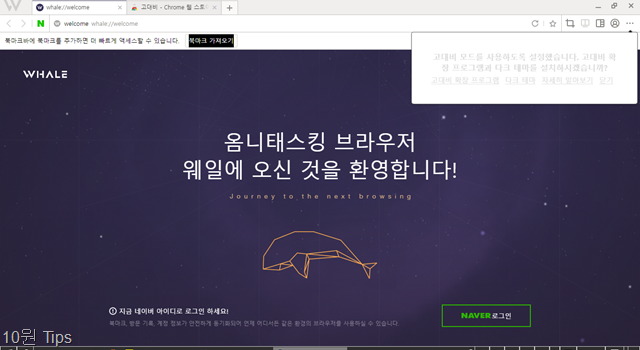
When you launch Whale, you get this welcome page.
Everything looks and works familiarly. Those buttons at top-right are for some of Whale's special features:
(By the way, that message that popped up was asking me about viewing methods. It recommended a high-contrast plugin, probably because my Windows theme uses a dark high-contrast theme. I doubt normal people would see this message.)
Naturally, the first thing I did was visit my own blog, and add it to the bookmarks bar.
You'll notice that there's a new button in that top-right section: a blue glowing "A". This is the auto-detected translation feature, which makes use of Naver's own Papago translation technology. Click it and it will translate the page. More on that in a second.
Let's start typing in the Omnibox (just realized it's called that now instead of omnibar).
Search recommendations from Naver automatically start to populate, just as with Google results on Chrome. You can change the default search engine from Naver to Google or others in the settings.
Meanwhile, clicking in the omnibox will bring up popular Naver sites, as well as lists some of your recently visited sites. This is definitely going to help keep you in the Naver ecosystem.
Time to open a new tab. Let's see what we get.
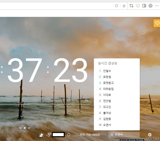
That's pretty. Very Bing-like. Current weather, a list of your visited sites, and an auto-updating ticker of current popular Naver searches round out the bottom of the page.
Click the popular search ticker to get the whole list. By the way, #2 on that list is likely trending because of this.
Now back to that auto-detected translation.
Click it, and a pop-up will confirm the language pair. It recognized that my blog is English and will convert to Korean.
And there it is. This makes use of Naver's Papago translation technology, which isn't half-bad most of the time. I find it to be generally on-par with Google, though of course far from perfect. A glance over at my bio there shows the limits of automated translation. Read about Papago here, and I took a look at the Papago Android app here.
It also automatically brings up a translation and definition box if you double click a foreign word.
What's Snapchat? Double click it and boom, it explains right there that it's a famous SNS photo app. That's handy.
One of the touted features of Whale is the sidebar, which supposedly offers various convenient tools. I personally find this more of a gimmick than something useful. Activate the Sidebar by clicking that orange button in the top-right below, or you can pin it so it's always there. Let's look at what's inside the Sidebar.
This opens a quick Naver search window, basically just the Naver mobile site. You can do a manual search here, or double click on keywords on the page and initiate it from the pop up definitions/translations box. I just did a search for girl group 2NE1 and get Naver's card-like results back. Not sure how this is better than the results just opening in a new tab.
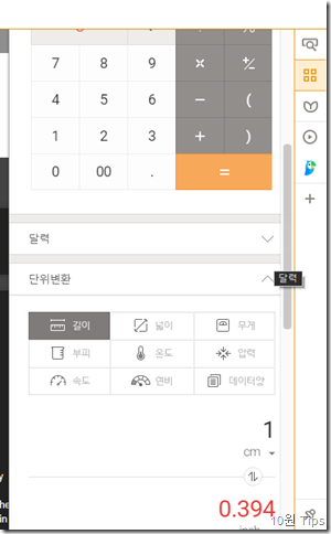
This mini-tab includes a set of widgets, including:
Sorry for this terrible photo. I wanted to show the calculator and the unit converter. I don't care enough to go back and do a better screenshot right now. Please understand my situation.
For me, I prefer how Google triggers infobox results like this when you search for stocks or unit conversions, etc. If your business work depended on checking this info multiple times throughout the day, then maybe. For me, it's a distraction.
I'm not sure what they mean by "belli" (밸리). The belly of the whale? This is a sort of scrapbooker tool. If you are familiar with the Google Keep Chrome extension, it's very similar. You can clip websites which get stored in this list, can be organized by categories, can have notes added, and are also available at the sitehttps://belli.naver.com/mybelli
Update: the site is now: https://m.belly.naver.com
You can see below that I added a few sample pages.
To add a page to your belli, just click the little whale-tail icon in the URL bar, between Refresh and Star (bookmark). It will turn golden if the page is added.
The sidebar also includes a direct access to papago translation. Bonus points to you if you can sing that song I translated there without crying or being overemotional.
This is just another little side window that loads the mobile version of a site. It's meant to keep your Facebook Newsfeed or etc. handy while you browse other stuff. Honestly I don't know why this stuff can't just be in other tabs. All these little side windows give an otherwise minimalistic and smooth Whale browser a clunky, 2005 feeling.
You can choose from their suggested sites, including Naver, Instagram, Webtoons, Facebook, Band, etc.
I just added my own blog, which auto-loaded in the mobile view. Pretty useless except for using it with Twitter or Facebook.
Another highlighted feature is Space, which just means split-screen browsing. On any page, click the top-right button that looks like a window cut in half, and it will open a new blank space to the right. Now, any link you click in the left side will open in the right side.
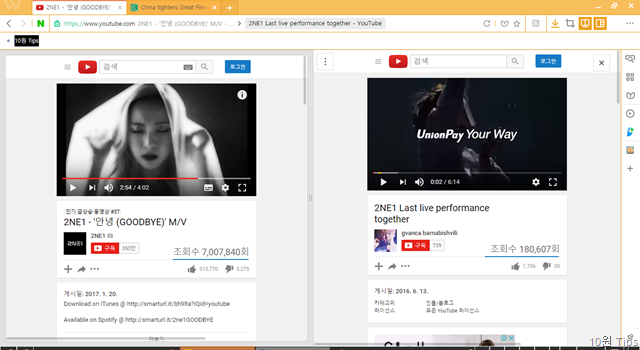
It works fairly well for some sites. For example, the YouTube page above auto-shrunk in width to maintain a good view.
But other sites, like the Korea Times, don't auto-adapt to the size of the window, forcing you to scroll and making the feature useless.
As someone who middle-clicks to open a thousand links in other tabs, this would drive me insane. Split screen browsing is one of those gimmicks that sounds cool until you use it once and realize you'll never use it again. Maybe that's just me.
Now this definitely caught my eye. You can add Chrome extensions straight from the Chrome Store to Whale!
Here I went to add Google's RSS feed finder extension. It worked, and loaded up in the top-right just like with Chrome.
And here it is actively working. I wonder if there are any limits to which Chrome extensions can be added?
Whale has a page in the settings menu for managing extensions (sorry, took this screenshot before adding that Chrome extension).
Clicking that big plus sign to find more extensions brings a pop-up saying the App Store is not yet ready. That's intriguing. Does that imply that Naver will maintain their own extensions store? Will they drop support for legitimate Chrome extensions at some point? Will Chrome be able to access and use Whale extensions? This will be interesting to see how it develops.
UPDATE: Yes, Naver is in the process (as of April 2017) of opening their own Whale Extensions store. You can find it here, although it's just a landing page right now:
https://store.whale.naver.com/extensions
UPDATE July 2017:
The Whale Chrome Extensions store is now open. See my followup post:
https://10wontips.blogspot.com/2017/07/naver-whale-browser-gets-extensions.html
Interestingly there's a link meanwhile to the Chrome Web Store that's titled 호환스토어 가기 (Compatible Extensions), so hopefully most major Chrome extensions will continue to work in Whale beyond Whale Extension Store's opening. There's also an impressive English-language Whale extensions development guide on GitHub:
GitHub - naver/whale-developers: Developers Guide for Whale Browser Extension
Just to round out the tour, here are what some key pages look like.
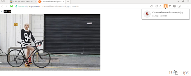
Here was a photo of Choa I downloaded. It brings up a small downloads box in the menu bar. I greatly prefer this behavior to Chrome's default bottom screen bar, which takes up huge screen real estate. Very good choice to manage downloads in this way.
Here's the downloads management page. Lots of categories to filter your downloads list.
History. Not much there at the moment. All of this can be backed up to your Naver account, and synced there.
Here are some general settings, including the theme color changer. Did you notice at some point on this tour I made my theme orange? If these colors aren't enough, you can add others after logging the browser into Naver, and can also add Google Chrome themes.
Whale has a "Reader" feature also that strips out junk for easy reading. Can you believe this was a Korea Times article? It's so… clean.
Here are two other things that really caught my eye.
This is huge. Buried in the settings was this option, right now still grayed out and can't be activated. Maybe once this leaves beta it will be?
It looks like a special Plug-in Compatibility handler. If you can't see the highlighted text in the screenshot, it reads:
UPDATE: It looks like this plug-in compatibility mode will only be operational for up to two years. From a recent Naver blog post:
So even Naver thinks this is a stop-gap measure that they plan to phase out. That's a good sign, since it suggests many major sites that would require it will be updated to more open standards. In fact here's a list Naver provides of the sites that would make use of the Plug-in Compatibility mode during that transition time:
And finally, though it's no big deal, there's a setting to manually limit how much memory Whale hogs.
I think the main thing with this Whale browser is that Naver sees a good opportunity to keep users from drifting over to Google. I'd sum it up like this:
Anyway, I don't know if the split screen and widgets and all that crap are useful though. I can see some users getting annoyed or confused. Good to keep them hidden behind a sidebar for the most part. It's a very usable browser, in line with a lot of Naver's recent apps, including English-language ones like Line and Papago.
I can't wait to see if they release an English-language version of Whale soon. Their website is already fully in English (http://whale.naver.com/en/) , so I'm guessing maybe so.
And if you need more Whale articles:
Finally I'll end this post with a piece from an interview with Naver’s head of service design, that makes me wonder what world he's living in exactly:
If you are familiar with Chrome, you will find Whale very familiar – it's built on top of the Chromium source. You can download the Windows version right now (Mac and Linux versions coming soon), but It is currently in beta release, so you'll need an activation code to complete the installation. I just signed-up with my email and they sent the code a couple of days ago (along with two additional codes for friends). So let me take you on a tour of this white Whale. Call me Ishmael.
Whale Tour
Opening
When you launch Whale, you get this welcome page.
Everything looks and works familiarly. Those buttons at top-right are for some of Whale's special features:
- refresh, and
- bookmark of course, but then
- a Screen Capture tool,
- Space (split-screen browsing),
- Sidebar (mini windows with various tools I'll outline below),
- Login (to your Naver account), and
- the three-dot menu.
(By the way, that message that popped up was asking me about viewing methods. It recommended a high-contrast plugin, probably because my Windows theme uses a dark high-contrast theme. I doubt normal people would see this message.)
Naturally, the first thing I did was visit my own blog, and add it to the bookmarks bar.
You'll notice that there's a new button in that top-right section: a blue glowing "A". This is the auto-detected translation feature, which makes use of Naver's own Papago translation technology. Click it and it will translate the page. More on that in a second.
Bookmarks and search in Omnibox
Let's start typing in the Omnibox (just realized it's called that now instead of omnibar).
Search recommendations from Naver automatically start to populate, just as with Google results on Chrome. You can change the default search engine from Naver to Google or others in the settings.
Meanwhile, clicking in the omnibox will bring up popular Naver sites, as well as lists some of your recently visited sites. This is definitely going to help keep you in the Naver ecosystem.
New tab page
Time to open a new tab. Let's see what we get.
That's pretty. Very Bing-like. Current weather, a list of your visited sites, and an auto-updating ticker of current popular Naver searches round out the bottom of the page.
Click the popular search ticker to get the whole list. By the way, #2 on that list is likely trending because of this.
Translation
Now back to that auto-detected translation.
Click it, and a pop-up will confirm the language pair. It recognized that my blog is English and will convert to Korean.
And there it is. This makes use of Naver's Papago translation technology, which isn't half-bad most of the time. I find it to be generally on-par with Google, though of course far from perfect. A glance over at my bio there shows the limits of automated translation. Read about Papago here, and I took a look at the Papago Android app here.
It also automatically brings up a translation and definition box if you double click a foreign word.
What's Snapchat? Double click it and boom, it explains right there that it's a famous SNS photo app. That's handy.
Sidebar
One of the touted features of Whale is the sidebar, which supposedly offers various convenient tools. I personally find this more of a gimmick than something useful. Activate the Sidebar by clicking that orange button in the top-right below, or you can pin it so it's always there. Let's look at what's inside the Sidebar.
Quick search
This opens a quick Naver search window, basically just the Naver mobile site. You can do a manual search here, or double click on keywords on the page and initiate it from the pop up definitions/translations box. I just did a search for girl group 2NE1 and get Naver's card-like results back. Not sure how this is better than the results just opening in a new tab.
Widgets
This mini-tab includes a set of widgets, including:
- A clock that displays both the current time and the time according to the webpage you are on
(I know what you're thinking, but this is actually a useful feature to Koreans who depend on getting the server's exact time right when, for example, buying quick-to-sell-out concert tickets or train tickets, or very often, college students trying to register for classes that are 1st-come-1st-served right when registration hour opens up.) - A calculator
- A calendar
- A unit converter
- A currency converter
- A stock ticker
Sorry for this terrible photo. I wanted to show the calculator and the unit converter. I don't care enough to go back and do a better screenshot right now. Please understand my situation.
For me, I prefer how Google triggers infobox results like this when you search for stocks or unit conversions, etc. If your business work depended on checking this info multiple times throughout the day, then maybe. For me, it's a distraction.
Belli scrapbook
I'm not sure what they mean by "belli" (밸리). The belly of the whale? This is a sort of scrapbooker tool. If you are familiar with the Google Keep Chrome extension, it's very similar. You can clip websites which get stored in this list, can be organized by categories, can have notes added, and are also available at the site
Update: the site is now: https://m.belly.naver.com
You can see below that I added a few sample pages.
To add a page to your belli, just click the little whale-tail icon in the URL bar, between Refresh and Star (bookmark). It will turn golden if the page is added.
Papago translation
The sidebar also includes a direct access to papago translation. Bonus points to you if you can sing that song I translated there without crying or being overemotional.
Mobile Window
This is just another little side window that loads the mobile version of a site. It's meant to keep your Facebook Newsfeed or etc. handy while you browse other stuff. Honestly I don't know why this stuff can't just be in other tabs. All these little side windows give an otherwise minimalistic and smooth Whale browser a clunky, 2005 feeling.
You can choose from their suggested sites, including Naver, Instagram, Webtoons, Facebook, Band, etc.
I just added my own blog, which auto-loaded in the mobile view. Pretty useless except for using it with Twitter or Facebook.
Whale Space
Another highlighted feature is Space, which just means split-screen browsing. On any page, click the top-right button that looks like a window cut in half, and it will open a new blank space to the right. Now, any link you click in the left side will open in the right side.

It works fairly well for some sites. For example, the YouTube page above auto-shrunk in width to maintain a good view.
But other sites, like the Korea Times, don't auto-adapt to the size of the window, forcing you to scroll and making the feature useless.
As someone who middle-clicks to open a thousand links in other tabs, this would drive me insane. Split screen browsing is one of those gimmicks that sounds cool until you use it once and realize you'll never use it again. Maybe that's just me.
Chrome Extensions (!) and App Store
Now this definitely caught my eye. You can add Chrome extensions straight from the Chrome Store to Whale!
Here I went to add Google's RSS feed finder extension. It worked, and loaded up in the top-right just like with Chrome.
And here it is actively working. I wonder if there are any limits to which Chrome extensions can be added?
Whale has a page in the settings menu for managing extensions (sorry, took this screenshot before adding that Chrome extension).
UPDATE July 2017:
The Whale Chrome Extensions store is now open. See my followup post:
https://10wontips.blogspot.com/2017/07/naver-whale-browser-gets-extensions.html
Interestingly there's a link meanwhile to the Chrome Web Store that's titled 호환스토어 가기 (Compatible Extensions), so hopefully most major Chrome extensions will continue to work in Whale beyond Whale Extension Store's opening. There's also an impressive English-language Whale extensions development guide on GitHub:
GitHub - naver/whale-developers: Developers Guide for Whale Browser Extension
Settings and other pages
Just to round out the tour, here are what some key pages look like.
Here was a photo of Choa I downloaded. It brings up a small downloads box in the menu bar. I greatly prefer this behavior to Chrome's default bottom screen bar, which takes up huge screen real estate. Very good choice to manage downloads in this way.
Here's the downloads management page. Lots of categories to filter your downloads list.
History. Not much there at the moment. All of this can be backed up to your Naver account, and synced there.
Here are some general settings, including the theme color changer. Did you notice at some point on this tour I made my theme orange? If these colors aren't enough, you can add others after logging the browser into Naver, and can also add Google Chrome themes.
Whale has a "Reader" feature also that strips out junk for easy reading. Can you believe this was a Korea Times article? It's so… clean.
Other interesting features
Here are two other things that really caught my eye.
IE Plug-in Compatibility Mode
This is huge. Buried in the settings was this option, right now still grayed out and can't be activated. Maybe once this leaves beta it will be?
It looks like a special Plug-in Compatibility handler. If you can't see the highlighted text in the screenshot, it reads:
플러그인 호환 모드So basically, a feature that might let Internet Explorer style plug-ins work in a Chrome-based browser. It specifically says it's for financial, governmental, and corporate sites. Remember that Swing Browser's whole purpose was this ability, which I noted here. So for everyone who thought they could escape the horrors of Korean online banking and shopping, get ready to say goodbye to IE, and hello to Whale and all the same hassles.
플러그인 호환 모드를 사용하시면 금융,정부,회사 업무 사이트의 호환 문제를 해결해줍니다.
플러그인 호환 모드 사용하기
UPDATE: It looks like this plug-in compatibility mode will only be operational for up to two years. From a recent Naver blog post:
웨일은 1년 안에 본 기능을 지원 중단하는 것으로 목표로
최대 2년까지만 지원할 예정입니다.
[출처] 플러그인 호환 모드|작성자 웨일 팀
플러그인 호환 모드 : 네이버 블로그
So even Naver thinks this is a stop-gap measure that they plan to phase out. That's a good sign, since it suggests many major sites that would require it will be updated to more open standards. In fact here's a list Naver provides of the sites that would make use of the Plug-in Compatibility mode during that transition time:
대법원인터넷등기소 www.iros.go.krSo basically a list of government tax and insurance sites, and some game sites. See a bit more about this at my other post here.
국민건강보험공단 www.nhis.or.kr
고용보험 www.ei.go.kr
국민연금관리공단 www.nps.go.kr
근로보험공단 www.kcomwel.or.kr
민원24 www.minwon.go.kr
홈택스 www.hometax.go.kr
나이스 www.neis.go.kr
넷마블 www.netmarble.net
한게임 www.hangame.com
다음게임 game.daum.net
엠게임 www.mgame.com
RAM usage limit
And finally, though it's no big deal, there's a setting to manually limit how much memory Whale hogs.
My thoughts about Whale and some other stuff
I think the main thing with this Whale browser is that Naver sees a good opportunity to keep users from drifting over to Google. I'd sum it up like this:
- Naver wants all that sweet, sweet userdata it can collect from people being logged-in to Naver at the browser-level. Well that's what Google does anyway with Chrome, so fair game there.
- IE is on life support, Edge has zero userbase, and Koreans generally still are not adopting Chrome beyond your cool friends*, not to mention the online banking and shopping headaches. Whale is going to fill the void. Naver Pay is seriously growing in popularity for its simplicity on mobile shopping. If they can bring that ease of payment to a browser Koreans will actually use, we might see the end of IE once and for all.
- Whale keeps users in the Naver ecosystem and makes accessing it a breeze. Right from the first download, all your stuff is there, Naver is already the default search, etc. Nobody likes "setting up" a browser. You don't have to go fishing through links or URLs or etc.
- Honestly, this is good for Koreans if Whale gets the same patched codebase as Chrome. Improved routine security by basically tricking users into using "Chrome" in all but name.
- Did I mention the userdata? What a goldmine.
According to data by web traffic analysis firm StatCounter, Chrome topped the list of the local web browser market share with 55 percent, with IE coming in second with a 35 percent share as of last month.See here, however, for an example of why I highly doubt that stat.
NTS under fire for not offering services for Chrome users
Anyway, I don't know if the split screen and widgets and all that crap are useful though. I can see some users getting annoyed or confused. Good to keep them hidden behind a sidebar for the most part. It's a very usable browser, in line with a lot of Naver's recent apps, including English-language ones like Line and Papago.
I can't wait to see if they release an English-language version of Whale soon. Their website is already fully in English (http://whale.naver.com/en/) , so I'm guessing maybe so.
And if you need more Whale articles:
- Naver’s battle against Google moves to web browsers : Business : News : The Hankyoreh
- Korea’s Naver releases its Internet browser Whale-INSIDE Korea JoongAng Daily
- Top S. Korea portal Naver challenges Google with new web browser | Aju Business Daily
- Challenge to IE, Chrome: Naver Releases Internet Browser Whale, Tapping into Web Browser Market | BusinessKorea
Finally I'll end this post with a piece from an interview with Naver’s head of service design, that makes me wonder what world he's living in exactly:
“The smartwatch is not designed to replace the phone, but to become another device where you can use the same services. It’s all about your lifestyle. If you’re usually at home, your main device could be your refrigerator, or your TV. It’s about being able to carry services through different devices. I think it would be fun to work on Naver services that go beyond the smartphone.”A fridge as your main device. You heard it here. Well considering how many times I get up and open it hoping there's another beer hidden somewhere that I didn't see the last time I opened it 5 minutes ago, maybe he's got a point.
[Eye Interview] At Naver, the user is always king









Comments
Naver search engine would be useful but switching search engine to duckduckgo.com saving a lot of "resources"