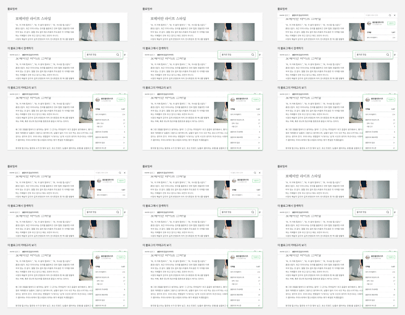
Naver Blogs are going through an upgrade recently. Along with upgrades to blog posting [see: Naver challenges YouTube with video-strong blogs, but hurdles persist], blog themes are also getting a refreshed, clean new look.
Part of this cleaner, sleeker refresh includes a new "floating bar" that allows for easy subscribing, and a profile banner that can pop in-and-out.
I think they're really taking a page out of Google's book here, considering that Google somewhat recently released very similar new themes for Blogger, which, you guessed it, include a floating bar for subscribing, and a pop-in-pop-out author profile badge.
A bit hard to notice in this promo shot, but if you've visited any Blogger blogs that use this theme, you'll notice right away the similarity. No comment here. Just drawing your attention to this interesting trend.
I've always admired how Naver Blogs have remained relevant in a way that foreign blogs have lost. Too much good content has moved to Facebook or behind other non-public walls. Any moves to revitalize blogging is positive in my book. I'm a bit uneasy about the seemingly growing success of Naver Post (essentially a Google Plus clone but actually used by people and organizations for simplified blog posting), because while it's beautifully designed and convenient, it lacks RSS feed support. I'm generally not a fan of services that you have to join in order to follow people. Feeds keep things easy and productive.
Anyway the new Naver Blog styles look neat. Crisp and clean. Way better than some of the goofy MySpace-ish early 2000s style themes you get on some Naver blogs. Not that I'm a design expert or anything.
Part of this cleaner, sleeker refresh includes a new "floating bar" that allows for easy subscribing, and a profile banner that can pop in-and-out.
 |
| Naver Blog's new floating bar. Image: Naver |
I think they're really taking a page out of Google's book here, considering that Google somewhat recently released very similar new themes for Blogger, which, you guessed it, include a floating bar for subscribing, and a pop-in-pop-out author profile badge.
 |
| New Blogger themes. Image: Google |
A bit hard to notice in this promo shot, but if you've visited any Blogger blogs that use this theme, you'll notice right away the similarity. No comment here. Just drawing your attention to this interesting trend.
I've always admired how Naver Blogs have remained relevant in a way that foreign blogs have lost. Too much good content has moved to Facebook or behind other non-public walls. Any moves to revitalize blogging is positive in my book. I'm a bit uneasy about the seemingly growing success of Naver Post (essentially a Google Plus clone but actually used by people and organizations for simplified blog posting), because while it's beautifully designed and convenient, it lacks RSS feed support. I'm generally not a fan of services that you have to join in order to follow people. Feeds keep things easy and productive.
Anyway the new Naver Blog styles look neat. Crisp and clean. Way better than some of the goofy MySpace-ish early 2000s style themes you get on some Naver blogs. Not that I'm a design expert or anything.
Comments