Here's a way of editing the font and text styles on your Blogger blog's mobile view. This will be useful if your blog's mobile view is showing a generic font instead of the customized fonts you chose for the desktop view.
Note: this post applies only to Blogger themes like Awesome Inc, Simple, Watermark, Etc. This does not apply to the new Blogger themes (Emporio, Soho, Notable, Contempo), which have no separate templates for desktop/mobile.
To make it work and get those pretty fonts on the mobile view, we just need to do two things:
But first, let me show you an example of what I mean. Scroll down to the next section if you want to jump right into the code.
Here's a blog using one of the "Awesome Inc" default templates. In the template editor (Template → Customize), I chose a variety of interesting and neat-looking fonts from Blogger's drop-down lists.
Even though Blogger's default templates' styles look a little bit outdated, we can make them look more modern and smooth by using better fonts at larger sizes.
I wanted a variety fonts, so for this example the blog uses:
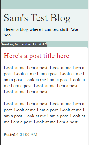
OK, looks good there on desktop view. But what happens when I check out the mobile view -- even when the mobile template selector is set at "Custom" as it should be?
It doesn't show the right fonts.
The mobile view ends up looking like this:
You can see that all the customized fonts are gone.
The problem is that sometimes if you use the nicer non-standard fonts on your blog, they only show on desktop view, and meanwhile a generic font is used on mobile like above. This seems to happen to any text style that uses a font other than these:
Note: this post applies only to Blogger themes like Awesome Inc, Simple, Watermark, Etc. This does not apply to the new Blogger themes (Emporio, Soho, Notable, Contempo), which have no separate templates for desktop/mobile.
 |
| Blogspot mobile view. Default-reverting template (L) and my corrected template (R) |
To make it work and get those pretty fonts on the mobile view, we just need to do two things:
- Add a few lines of code to the template to load the fonts we are using
- Add a few lines of CSS to display them in the mobile view
But first, let me show you an example of what I mean. Scroll down to the next section if you want to jump right into the code.
Example of a blog not displaying the right fonts in mobile view
Correct fonts/styles on desktop
Here's a blog using one of the "Awesome Inc" default templates. In the template editor (Template → Customize), I chose a variety of interesting and neat-looking fonts from Blogger's drop-down lists.
Even though Blogger's default templates' styles look a little bit outdated, we can make them look more modern and smooth by using better fonts at larger sizes.
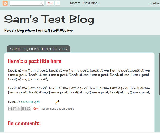 |
| Desktop view, utilizing a variety of fonts |
I wanted a variety fonts, so for this example the blog uses:
- Post titles font = Kenia
- Date header font = Syncopate
- Blog title font = Cherry Cream Soda
- Blog description font = Chewy
- Overall Page font = Fontdiner Swanky
OK, looks good there on desktop view. But what happens when I check out the mobile view -- even when the mobile template selector is set at "Custom" as it should be?
It doesn't show the right fonts.
Example of Blogger's failure to apply customized fonts to the mobile template
The mobile view ends up looking like this:
 |
| The variety of fonts all revert to generic fonts in the mobile view |
You can see that all the customized fonts are gone.
The problem is that sometimes if you use the nicer non-standard fonts on your blog, they only show on desktop view, and meanwhile a generic font is used on mobile like above. This seems to happen to any text style that uses a font other than these:
- Arial
- Courier
- Georgia
- Impact
- Times New Roman
- Trebuchet
- Verdana
These essential fonts are easily and automatically recognized by a mobile browser, but our special fonts (Chewy, Cherry Cream Soda, Kenia, etc.) are not.
So we need to do those two things I mentioned at the beginning to get them working on mobile:
- we need to manually tell the template to load these fonts
- we need to instruct the fonts to be displayed via CSS
Change the template code to make the fonts show in the mobile view
Now it's time to add the codes to make the fonts show on mobile views.
1. Add the fonts to the blog template
Make a list of which fonts you are actually using in your template. Again, ignore any of the basic ones listed above. Just make a note of the special Google fonts you chose from the drop-down menus (in Template → Customize → Advanced).
For my example above, I was using:
- Kenia
- Syncopate
- Cherry Cream Soda
- Chewy
- Fontdiner Swanky
For each of those, I need to enter a single line of code in my template (Template → Edit HTML).
To do this, first find this line near the top of your template HTML:
<b:include data='blog' name='all-head-content'/>
Just above it, we will place the lines for each font. The line looks like this, with FONTNAME replaced by your font:
<link href='http://fonts.googleapis.com/css?family=FONTNAME' rel='stylesheet' type='text/css'/>
So for my example blog, I will add these codes:
 <link href='http://fonts.googleapis.com/css?family=Kenia' rel='stylesheet' type='text/css'/>

<link href='http://fonts.googleapis.com/css?family=Syncopate' rel='stylesheet' type='text/css'/>

<link href='http://fonts.googleapis.com/css?family=Cherry Cream Soda' rel='stylesheet' type='text/css'/>

<link href='http://fonts.googleapis.com/css?family=Chewy' rel='stylesheet' type='text/css'/>

<link href='http://fonts.googleapis.com/css?family=Fontdiner Swanky' rel='stylesheet' type='text/css'/>
2. Add the CSS code to display these fonts in the mobile template
Now that we added the fonts to the template, we still need to add CSS to show them. This part can be annoying, since we need to do it manually for each part/area/section of your blog.
For example, if you chose a special font for the blog title, we need to add a code entry for the blog title -- one entry for each and every section we want to customize. Don't worry, just copy and paste from my example.
Here's a cheat-sheet of common sections you likely will want to customize:
Based on my example from before, I would add the following code to my blog template's CSS (Template → Customize → Advanced → Add CSS). I've added comments to the code so you can see what each part is doing.
For example, if you chose a special font for the blog title, we need to add a code entry for the blog title -- one entry for each and every section we want to customize. Don't worry, just copy and paste from my example.
Here's a cheat-sheet of common sections you likely will want to customize:
- Post titles in the individual posts mobile view =
.mobile h3.post-title - Posts titles in the list of posts =
.mobile-index-title - Blog description in mobile =
.mobile .Header .description - Blog title in individual posts view =
.mobile .Header h1 a - Blog Title mobile view list page only =
.mobile .Header h1.title - Post content text in mobile view =
.mobile .post-body - Date stamp in mobile view =
.mobile .date-header
Based on my example from before, I would add the following code to my blog template's CSS (Template → Customize → Advanced → Add CSS). I've added comments to the code so you can see what each part is doing.
 /* Post titles in the individual posts mobile view */

.mobile h3.post-title {

font: normal 20px Kenia;

}

/* Posts titles in the list of posts */

.mobile-index-title {

font: normal 20px Kenia;

}

/* Blog description in mobile */

.mobile .Header .description {

font: normal 16px Chewy;

}

/* Blog title in individual posts view */

.mobile .Header h1 a {

font: normal 22px "Cherry Cream Soda";

}

/* Blog Title mobile view list page only */

.mobile .Header h1.title {

font: normal 22px "Cherry Cream Soda";

}

/* Post content text in mobile view */

.mobile .post-body {

font: normal 12px "Fortdiner Swanky";

}

/* Date stamp in mobile view */

.mobile .date-header {

font: normal 12px Syncopate;

}
The end result is that the mobile template now essentially matches the desktop template view.
 |
| Desktop view, customized in Theme Editor |
 |
| Mobile view, customized by my code |
Final Thoughts
Now that you've done all this hard work of setting up the CSS for that mobile template, it's now very easy to tweak it by adding any other properties to any section to do other fun things. For example, from here you could very easily tweak the code to do things like:
- center the blog title or post titles in mobile view
- adjust the font sizes in the mobile view
- adjust the colors of any particular section
- change the alignment
And of course, any other CSS-based properties. Customize to your heart's content. Basically, adding
.mobile before any CSS element will affect the mobile template version.Personally, I think a good way to get a more "modern" look on these older templates is to:
- center all titles
- increase the font size of titles
- decrease the font size of the post content
Although all this is manageable, it's sure a lot of hoops to jump through. It's disappointing that the customizations you make in the Template Customizer don't automatically get reflected in the mobile template (most do; custom fonts do not).
I hope Blogger will address this issue soon,
Update: Yes, the four new Blogger templates for 2017 do maintain font customizations in both desktop and mobile views, because they don't have separate 'mobile' template to worry about. They dynamically adjust to screen size.
Happy blogging.
Comments
Thank you so much.
It looks like you're already using Kenia, without problems. The template you're using right now (Soho) is one of the newer responsive themes, which don't have the problem my post was talking about. Contempo, Soho, Emporio, and Notable won't have any problem like this.
Now if you're still trying to add a custom font, that might be tricky. The post you linked to is giving instructions for the older templates. Emporio is different. It looks like you're using the Ubuntu font on it, which will appear both desktop and mobile.
Could you help me with a custom CSS code of how to make text in mobile view not to appear HUGE on mobile devices without affecting text size in PC or tablet view?
.mobile .post-body {font-size: 40px;}
Then add this code in the "Add CSS" section. Change the size to whatever number you want:
.mobile .post-body {font-size: 10px;}
i used this
.mobile-index-thumbnail {
width: 640px;
}
but its not working
.mobile-index-thumbnail img {width:640px;}
But do you want your mobile thumbnail stretched that big? On mobile that would look terrible.
Another issue is that the mobile thumbnail images are generated at 72x72 px. So even if you change its size in CSS, the image itself doesn't change size. As a result, it will end up looking fuzzy and unclear. You'd have to edit the blog template itself if you really want larger images on mobile. To do that, check out this tutorial; it may be what you're looking for:
https://www.carrieloves.com/2016/04/how-to-increase-the-size-of-blogger-thumbnails-mobile-template/
table tbody {font-family: 'Comic Sans MS', 'Comic Sans', 'Chalkboard SE', 'Comic Neue', 'Lobster', fantasy, cursive, sans-serif;}
However, some modern browsers don't have support for displaying Comic Sans anymore. So I listed several other options there that will hopefully make your table look similar to Comic Sans.
If it still doesn't look right to you, you may have to direct the browser to fetch the Comic Sans font. That means adding both a line of code to your "Add CSS" and another line of code to your blog header (in the Template HTML editor). See here for how to do that: http://allfont.net/download/comic-sans-ms/